GnomeWeb > GnomeWeb/LooknFeel > GnomeWeb/LooknFeel/FooterDesign
1. WGO Footer Design
Here are 7 different mockups of how the footer could look. All SVGS available at http://people.redhat.com/duffy/gnome-brand/wgo/footers/
Contents
1.1. Mockup #1

1.2. Mockup #2
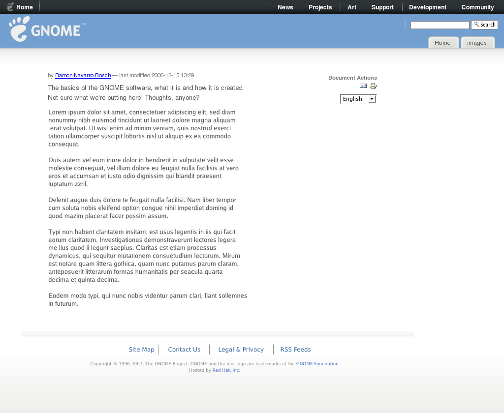
1.3. Mockup #3
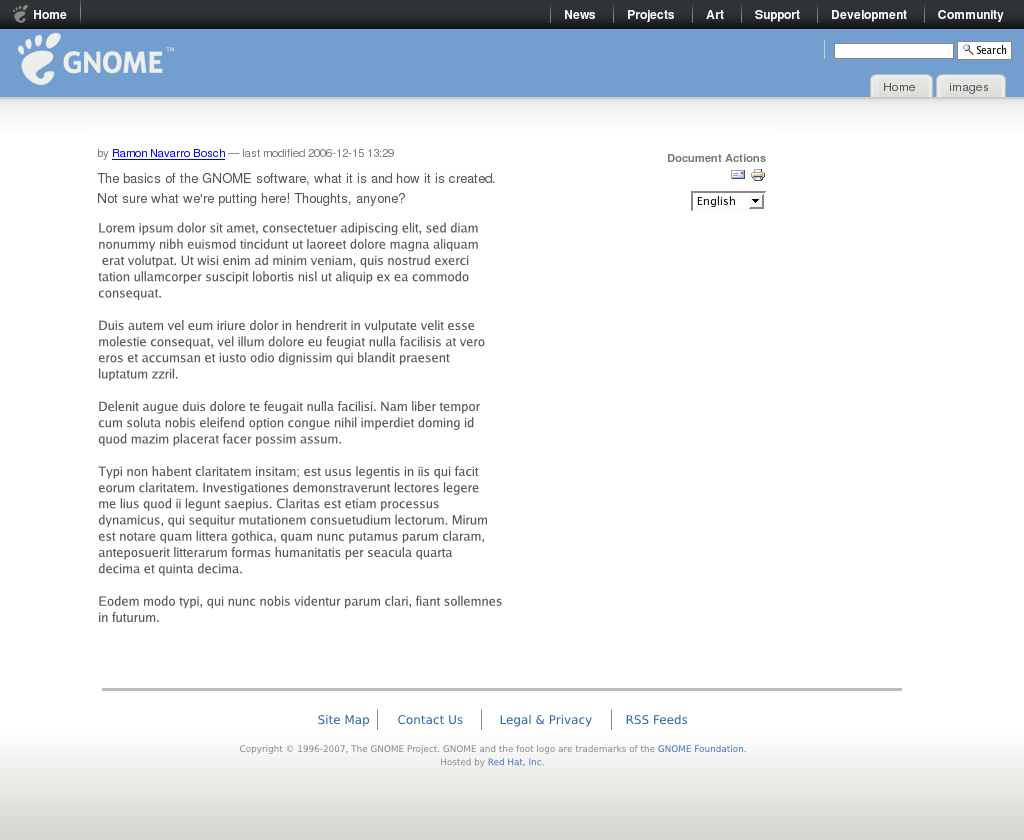
1.4. Mockup #4

1.5. Mockup #5
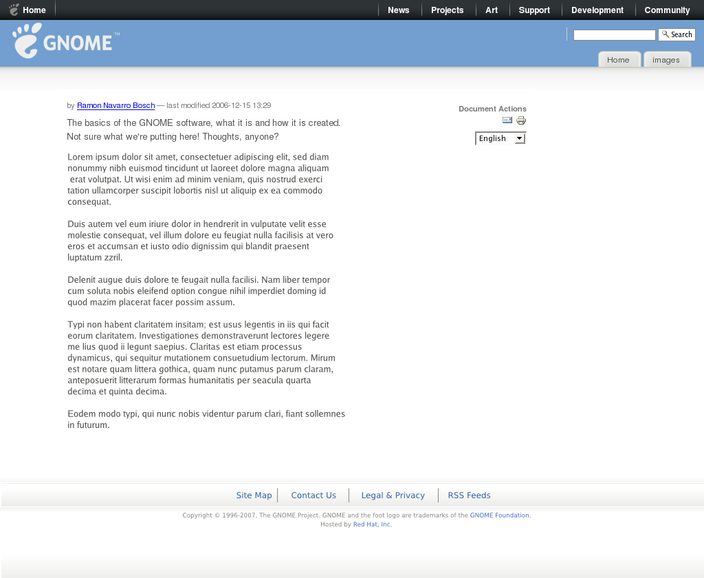
1.6. Mockup #6
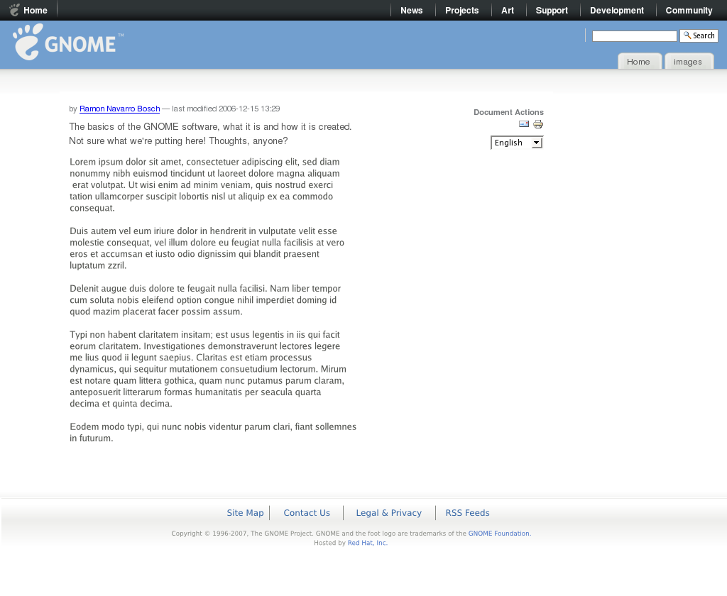
1.7. Mockup #7
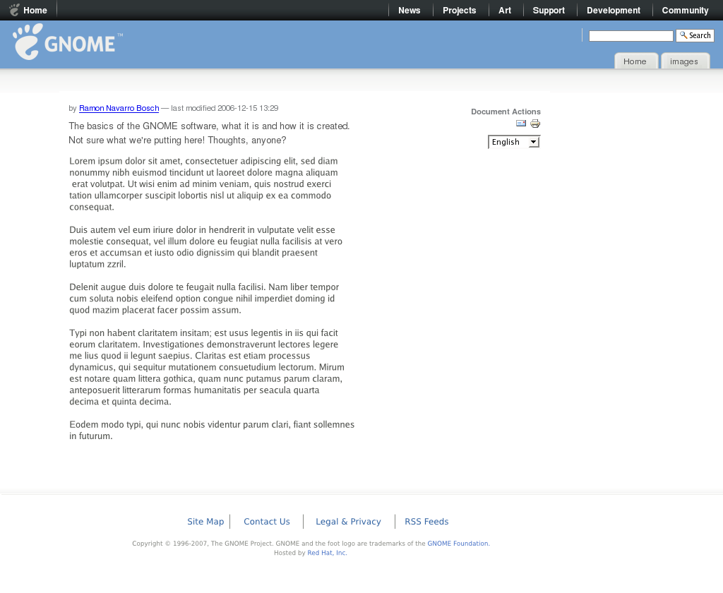
All SVGS available at http://people.redhat.com/duffy/gnome-brand/wgo/footers/
1.8. Comments
SimonRozet: I vote for #1. IMHO, all of those buttons (WAI, XHTML etc) are completly useless.
JohnWilliams: FWIW, I like #6 the best, mainly because it wastes the least vertical space.
StefanKost: #1 looks best, but could be a bit slimmer.
