Design ● OS ● Apps ● Whiteboards ● GNOME Shell ● System Settings ● How to contribute
Removable devices hotplug
Contents
The experience with hotplug and removable devices is still not optimal in GNOME 3.0. Here's a page to describe the problem space and discuss a design to make it better.
Participants
Cosimo Cecchi, William Jon McCann.
Status
 Needs design
  Design in progress
  Needs implementation
  Implementation in progress
  Stable
Relevant art
GNOME 3.0 (2.x is quite similar)
Ejecting
- unmounting/ejecting is done from Nautilus only.

Autorun
What we do right now in GNOME 3.0 by default:
- media that have an application set to autorun by default open that application. Note that right now by default, application autorun is turned off for all content types by default except for the software case (see next point).
- for media that contains software that can be autorun (does it even exist for Linux?) we show an autorun prompt, which is a separate binary living in the nautilus tree
- for media that do not have an application set to autorun by default, but have a content type (e.g. a photo camera or an audio CD) we show a dialog asking what application to open, with a "remember this option" checkbox
- for media that do not have a content type (e.g. a regular USB pen) we open the file manager, which is fine.
- System Settings has a panel to change the autorun options.


Mac OSX
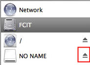
Ejecting
They have a desktop, so you can always use the context menu on the desktop icon.


Autorun


Windows 7
Ejecting


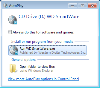
Autorun


Discussion
Ejecting
- We should really have a way to eject devices without going to the file manager. Some possible ideas:
- Have a system indicator appear when there's a device mounted, listing the plugged removable devices.
- The system indicator should appear only when there are devices mounted, and should not be used to open the CD tray as it happens in OSX
- The menu could also repeat the autorun action if a device is selected.
- Have an icon in the notification area while a device is plugged.
- Basically it's the same idea as the system indicator, except that it's implemented as a notification. I really think the system indicator would be better, and would play nicer with using a system modal dialog for autorun choices, as outlined below.
- Have a system indicator appear when there's a device mounted, listing the plugged removable devices.
Autorun
- Devices can have more than one content type.
- a modern smartphone is both a photo camera and a music player.
- When it's not controversial (i.e. there's only a possible content type), we should always autostart an application by default.
- if I plug in my photo camera, Shotwell or FSpot should start automatically, if I insert a blank CD, Brasero should be started automatically.
- When there's more than a content type for a device (e.g. the smartphone case), a system modal dialog should be spawned by the shell, asking what to do with the device (Jon had a mockup for this).
- should we be able to remember a setting per-device? Probably not...
- the dialog should be easily dismissed with a cancel button, or by pressing Esc, as the user might have plugged the device in just to recharge the battery.
- in case there's an application capable of handling the device already focused (e.g. Shotwell) should we still display the modal dialog? Probably only in some cases.
- I have Shotwell open already and focused, with no other devices attached. I plug in my smartphone, Shotwell should directly ask if I want to import pictures.
- I have my camera plugged in, working in Shotwell. I plug in my smartphone too, what should happen? Probably show the dialog in this case?
Comments
- In case there's more than an application to support a given media, what should we do?
- Show the dialog the first time and then default to the choice in the future
- Should applications behave like web browsers or mail clients that ask you if you want to default to it in the future?
- We should make sure applications do not claim to support media that don't work for the autorun case
- Brasero claims it can support Audio CDs, which is kind of true, but it doesn't play nice with this design.
When using a docking station for your phone, the device will be plugged/unplugged all day long. Should there be a way to disable this? (-- BastienNocera 2011-06-23 21:45:12)
Tentative Design
- After sitting down and thinking a bit more about it with Jon, we changed a few things from my original thoughts, and came up with a coherent workflow.
- Basically there are two moments we really care about what we plugged in
- When the device is attached
- When the device is to be ejected, or listing the attached devices
Attaching a device

The primary goals of the UI when attaching a device are Notice and Open. The design implements this with a notification, which pops up (notice) and offers a list of the default applications for the sniffed content types offered by the device (open).
When clicking empty space in the notification (i.e. also the device icon/name), it could probably run the default action (i.e. the application listed as first in the list, if there are multiple content types detected), or it could close the notification, as in "ignore now". Otherwise the notification will automatically expire (it's transient).
If the device is a special one (i.e. a phone, or a music player), we have the low-level infrastructure already that takes care of listing the possible content types for the device. It would be great to be able to sniff content types also in case when regular drives are plugged in, like e.g. Windows does. This means attaching a thumb drive with some pictures and music files in it should still offer Photos and Music as possible choices. Bonus points if it orders the content types based on the amount of files for each content type. I heard Tracker has a component to scan removable media on insertion; migth be worth investigating.
A secondary goal is still Eject here, and the notification should have a button to do that directly from there.
Ejecting a device or listing devices

The primary goals of the UI are Eject and List. The design implements this using an item in the message tray (similar to WebOS) containing all the attached devices plugged during the session (this means we should ignore e.g. devices mounted by other users on the system in different sessions, or drives mounted at a system level via fstab or whatever). The Eject icon, should obviously do what it says.
A secondary goal is still to repeat the Open action here, so clicking on the device icon/name should probably open the default action determined at the previous step.
