Initial Application States
This page is out of date and no longer maintained. For up to date design guidance, see the HIG.
Initial or welcome pages, to be displayed by applications on first run (in some situations).
Contents
Goals
When opening an application for the first time, ensure that it:
- Looks good.
- Is welcoming.
- Isn't negative or a downer.
- Isn't boring.
- Guides you into using the app - if users need to know something to use the application, the information should be communicated. Likewise, if the application has a relatively technical or obscure purpose, it should explain what it is for.
Visuals should be consistent with OS branding, particularly those used in initial setup.
Out of scope for now: first run setup/configuration.
All of this is mostly relevant for applications that present content items in their main view, and might be empty when first run.
Relevant Art
Chrome

iTunes

Firefox 35
OS(2f)InitialStates/ff-first-run-1.png)
OS(2f)InitialStates/ff-first-run-2.png)
OS(2f)InitialStates/ff-first-run-3.png)
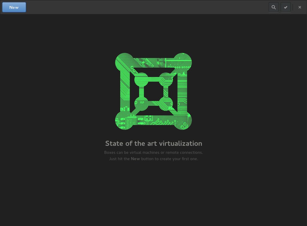
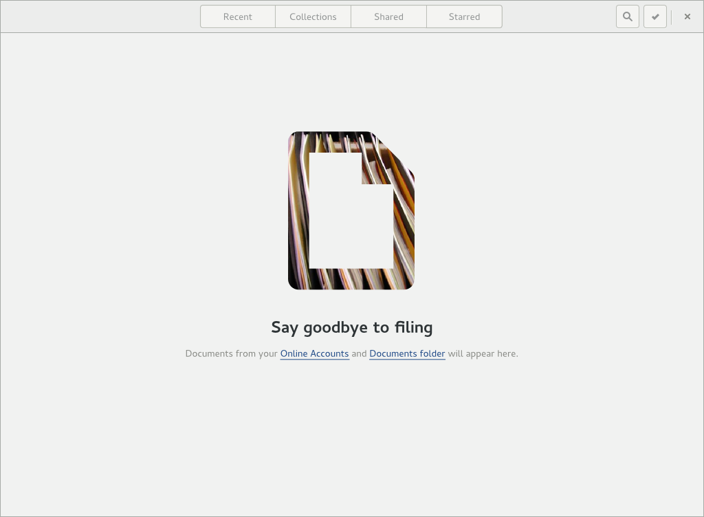
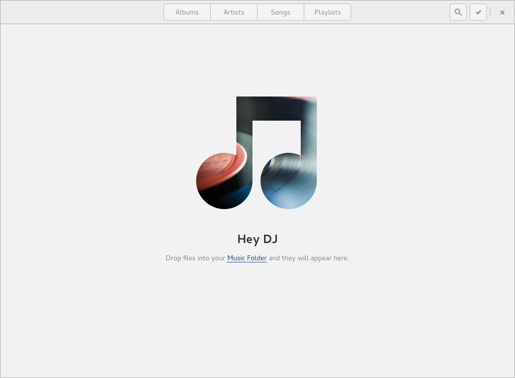
GNOME 3
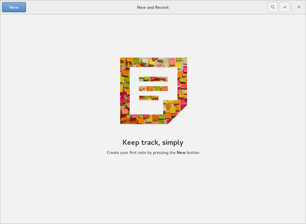
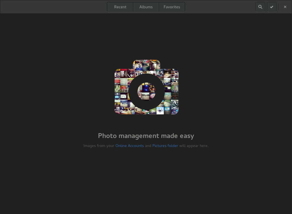
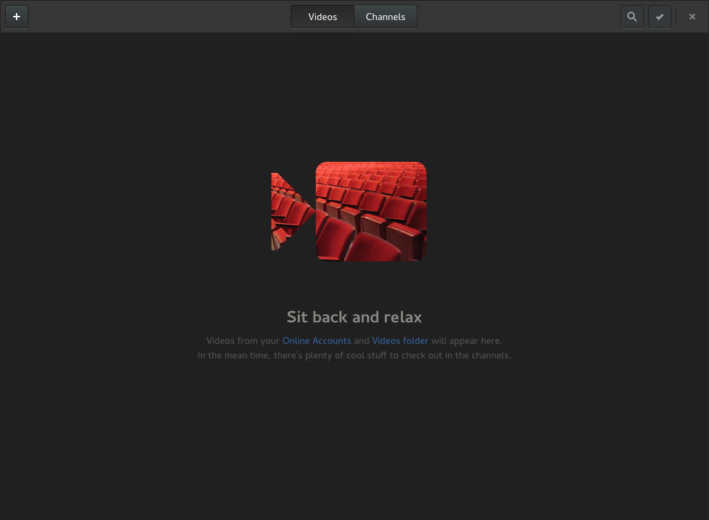
Screenshots taken with GNOME 3.14 running under Fedora 21. For this test no online accounts were connected.
Discussion
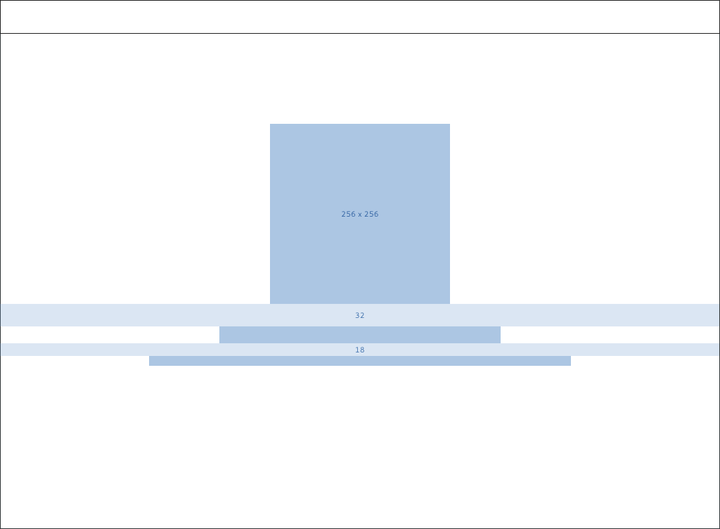
- Size of icon?
- Initial Window position?
- Color of text?
- Maximized?
- Link to Online Accounts or File Manager?
- Initial state and empty state might be different - with an initial state, the emphasis is on welcoming and guiding the user. If the application then becomes empty, you might want to present a different view depending on the type of application.
Tentative Design
Initial state should be displayed from first run, when no content items are present. It can be displayed over multiple runs, but should not be shown once content has appeared (if the application subsequently becomes empty, it should display the empty state).
Bugs
To do |
|
To do |
|
To do |
|
To do |
|
To do |
|
To do |
|
Initial setup |
To be requested if a sufficient number of apps are fixed |
Comments
