Dropdown Lists
Designs for a combobox replacement widget.
Participants
WilliamJonMcCann, JakubSteiner, AllanDay
Goals
- Select a value from a list of options
- Easily and comfortably find a value from a long list of options, using scrolling and search
Other possible goals:
- Allow a custom value to be entered
- Allow values to be be grouped
- Multiple selections
- Selections that aren't just text - could be an image or image+text
Relevant Art
Material Design: Dropdown Menus
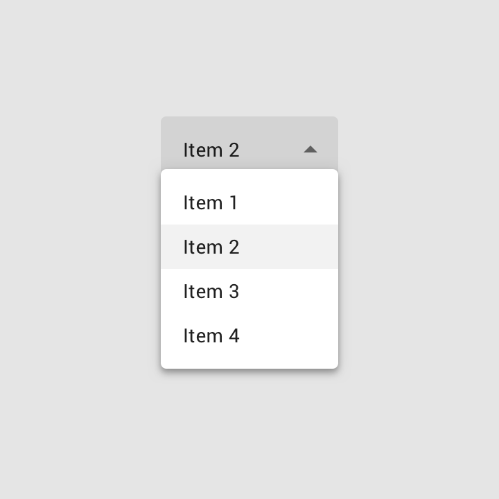
https://material.io/design/components/menus.html
Universal Windows Platform: Comboboxes
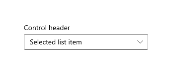
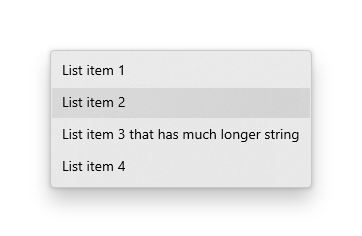
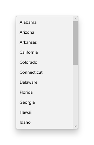
https://docs.microsoft.com/en-us/windows/uwp/design/controls-and-patterns/combo-box
Chosen
OS(2f)DropDowns/chosen-standard-select.png)
OS(2f)DropDowns/chosen-multi-select.png)
http://harvesthq.github.io/chosen/
Allows search, grouping and multiple selection through tokens.
GNOME
OS(2f)DropDowns/gnome1.png)
OS(2f)DropDowns/gnome3.png)
OS(2f)DropDowns/gnome2.png)
Issues:
- The scrolling behaviour is difficult to use.
- No visual anchor when the list is open.
- No obvious way to close the list when it is open.
- Nno search.
- Room for improvement when entering a custom entry - better to show preset/prexisting options before allowing the custom entry to be set. This avoids possible discoverability issues.
Discussion
Dropdown lists are very similar to menus in appearance and interaction. Indeed, a menu comprised on radio buttons can play a very similar role to a dropdown list. The main difference is that a dropdown list's button indicates the selection, and a dropdown list is better optimised for large numbers of options (at least, it should be). This is reflected in Material Design, where dropdown lists are just a type of menu.
Tentative Design
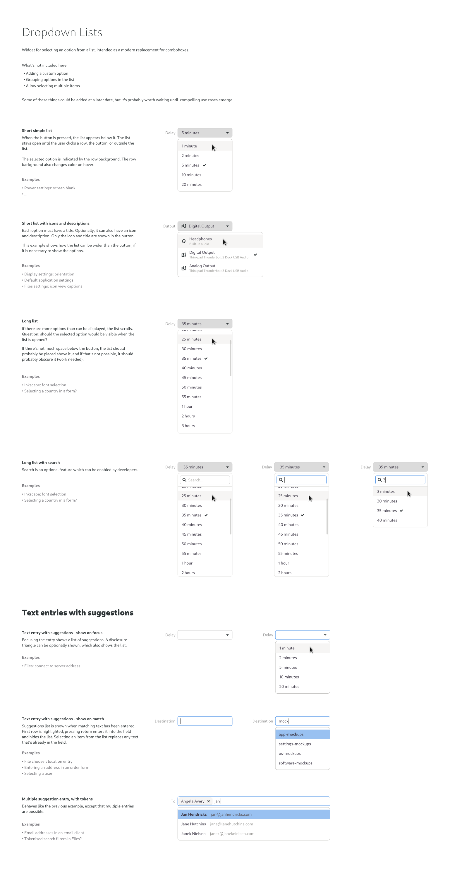
There are some old mockups here.
Comments
