Date & Time Selection
Contents
Introduction
We need an improved and consistent design for how date and time selection works across the OS.
Designers
Objectives
- Select a specific time of day (ex. for an appointment)
- Select a duration (ex. for a timer)
- 24 hour and AM/PM modes
- Select a specific date (ex. for a flight)
- Support both touch and precision pointing
Constraints
Relevant Art
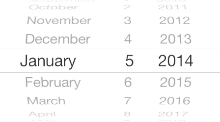
iOS


Android

Nokia N9
OS(2f)DateTimeSelection/nokia-n9.jpg)
Windows Phone
OS(2f)DateTimeSelection/win-phone-time.png)
OS(2f)DateTimeSelection/win-phone-date.png)
GNOME 2
OS(2f)DateTimeSelection/gtk-calendar.png)
Extremely small target areas for changing month and year and selecting day. Optimized for selecting dates near the current date. Days from other months shown in same view with same styling despite month heading at the top.
Mobiscroll
Discussion
General observations:
- Selecting dates near the current date is most common.
- There are often issues with scroll-based widgets (particularly seen on mobile) - can be rather tricky to use.
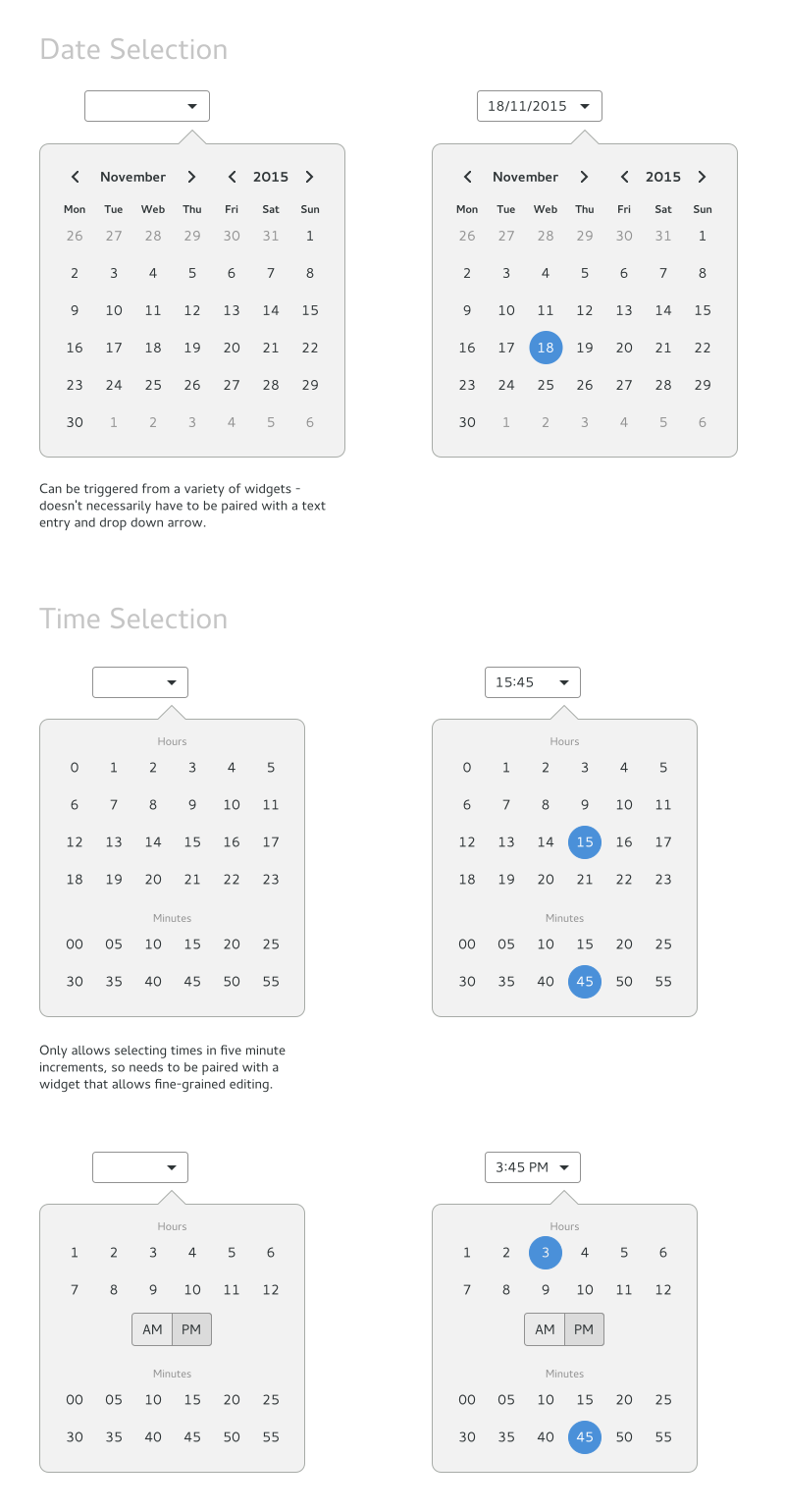
- Generally times are used in 5 minute increments - would be good to prioritise this, with secondary functionality to fine tune to an exact time.
See mockup experiments for various ideas and discussion.
Tentative Design

Comments
