Content Selection
Contents
System-provided content selection dialog. Differences between this and file selection:
1. Content doesn't have to be files, stored locally.
2. It is designed to be compatible with application sandboxing.
Designers
Primary Use Cases
- Add an attachment to an email.
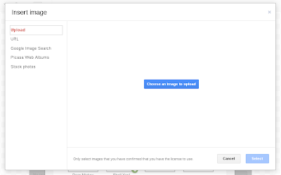
- Insert image into a document.
- Add item to Music/Photos/Videos library.
- "Paste" a URL from one service to another.
Objectives
- Emphasise recently used content.
- Fast and effective search.
- Effective content previews.
- Allow applications to provide content to be selected.
- Filter according to which app is providing the content.
Constraints
Compatible with application sandboxing:
- Dialog needs to be isolated from the applications that use it.
- Can't assume that apps have access to the file system.
Relevant Art
WebOS
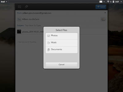
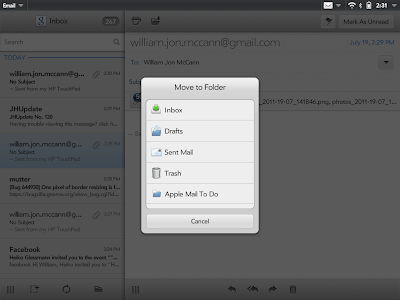
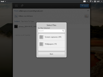
Google Docs
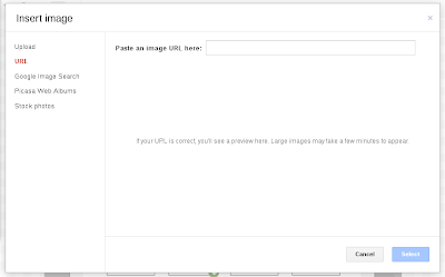
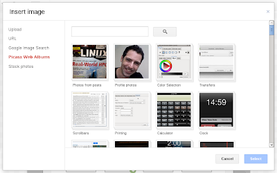
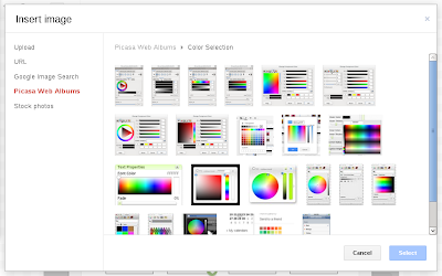
Windows 8
OS(2f)ContentSelection/win8-files.png)
OS(2f)ContentSelection/win8-select-music.png)
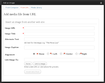
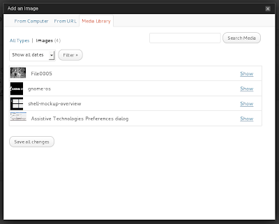
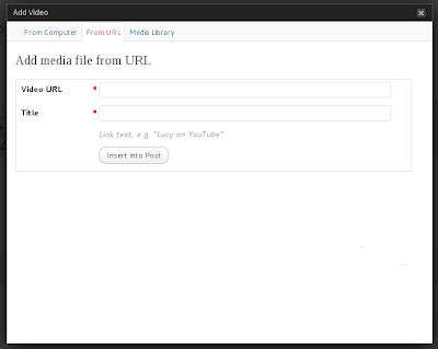
Wordpress
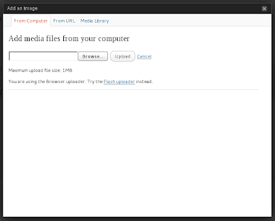
Discussion
Tentative Design
The following is a highly tentative design concept. It comes with the caveat that it doesn't include proper file browsing.

Older mockups:
Comments
SriramRamkrishna - Hi Allan! How do you deal with things like inkscape or something that is not part of the list? I assume that GNOME apps will register as a source. But if you're using something from KDE or some commercial app, what happens then?
CarlosSoriano - What will Files provide? Files it's not a "plain or 2 deep" container like photos or documents. Also, I though Files was the Filesystem explorer, like the "fallback" for desktop use cases. So I think we will need a solution here.
- Having the searchbar at the topbar seems strange to me - can't we do type to search just as in every app, i.e. a search button and an appearing row below the top bar holding the search field? After all the header bar is there for holding the heading even if its only saying to us that that thing is a content chooser.
It seems you don't want the search to be available on the second level, within a collection. Any reason for this? If the reason was the heading, see upper comment

- Having collections but limiting them to one level seems to me like delivering a half baked thing. On top the obvious caveat is already noted: although we want to get away from the old school file browsing we won't be able to get away from it so fast.
Option one: the fallback already mentioned by CarlosSoriano. Similar to what gedit does with its open popover we could provide a "browse files manually" button which transforms this dialog into a dialog which should ideally be as similar as possible to the nautilus interface for consistency. (Note transformation, not a dialog above a dialog. After all only the sidebar contents need to be replaced and some path choosing control needs to be introduced in the headerbar. Besides this is very similar to the original dialog and thus fits nicely.)
- Option two: remove that limit of collection recursiveness. Files could just provide nested collections. That would be awful to browse.
- Can't think of anything else. I'd go for option one.
- I love that app provider concept and now intuitive the search filtering works.
- If an app wants some content it should be able to specify what kinds of content it allows. Each provider should do the same. Thus we can limit the provider apps significantly in many cases providing only contextually thoughtful things to the user.
See Also
Very preliminary API discussion in the GTK+ page for content selection.
