Software
Contents
Introduction
A nice way to manage the software on your system.
Designers
William Jon McCann, Jakub Steiner, Allan Day
Objectives
Goals
- View installed applications
- Remove installed applications
- View available application updates
- Install available updates
- Find new applications
- Install new applications
- Find an application to handle a specific type of file
- Installed apps and updates should be available when offline
Constraints
Relevant Art
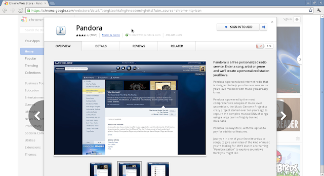
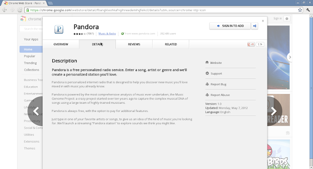
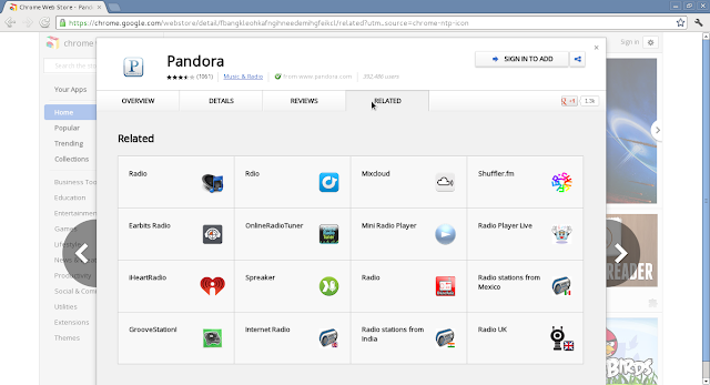
Chrome


Categories: Business Tools, Education, Entertainment, Games, Lifestyle, News & Weather, Productivity, Social & Communication, Utilities, Extensions, Themes
Google Play
Categories: Books & Reference, Business, Comics, Communication, Education, Entertainment, Finance, Health & Fitness, Libraries & Demo, Lifestyle, Live Wallpaper, Media & Video, Medical, Music & Audio, News & Magazines, Personalization, Photography, Productivity, Shopping, Social, Sports, Tools, Transportation, Travel & Local, Weather, Widgets
iPad
Categories: Books, Business, Catalogs, Education, Entertainment, Finance, Games, Health & Fitness, Lifestyle, Medical, Music, Navigation, News, Newsstand, Photo & Video, Productivity, Reference, Social Networking, Sports, Travel, Utilities, Weather
GNOME

Ubuntu
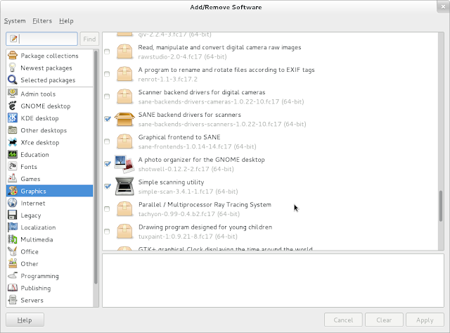
Categories: Accessories, Books & Magazines, Books & Magazines, Education, Fonts, Games, Graphics, Internet, Office, Science & Engineering, Sound & Video, Themes & Tweaks, Universal Access, Developer Tools, System
https://wiki.ubuntu.com/SoftwareCenter#line-723
Discussion
- We can assign a donation cost to each project where the GNOME Foundation takes a small fixed percentage to be used for project support and to be distributed equitably to dependencies for the app.
- The vast majority of the donation cost should be given directly to the author and/or organization responsible for creating the application. This provides incentive for new app creation and allows the organization to do its own planning for future growth and new feature development.
- An app can either ask for an additional / mandatory cost or request a minimum payment required for maintaining the service provided to the user by the GNOME Foundation.
- Apps can ask donations at most once a GNOME release cycle. This provides incentive for project maintenance.
- Organizations or individuals can "purchase" licenses that permit bypassing per app donation costs.
- Friends of GNOME donation gifts.
- Corporate site licenses.
- Members of companies in the GNOME Advisory Board.
Tentative Design
Current working designs can be found in the gnome-mockups-software repository.
Comments
What I miss from the current design is a integrated way to make donations to the projects using Paypal -OliverPropst
Entries for software that is already installed should not been shown at "Popular". I as a user don't care about popular software, that's already installed. Make the whole thing more personal. Show under each "Popular" entry its category (I know we dont have much space here, but the user has to know somehow what its about becouse the names say nearly nothing). Use verbs for the 3 view panes: "Explore" "Manage" "Update". For the "Categories", on mouseover extend the selection to a bigger area (of course to the bottom), let a small image fadein that matches the category, and show text (maximum 2 sentences) about the selected category. --EduardGotwig
The proposed design is great, but what would be nice is to have "Software" with this design not as an external "App", but directly integrated within the Shell in "Search" (i.e., integrated in https://live.gnome.org/GnomeShell/Design/Whiteboards/Search). Basically extending gnome Shell 3.6 experience with this new design proposed for "Software". In this case, we could directly search for installed apps, install non-installed apps, have an overview of the software, click on install ... all within the Shell. In this new paradigm, "Software" is not an "App", but a full part of the Shell. --TeriSeika
We might need design for the actual install workflow too: 3rd party applications (repo or downloaded package files) might need a warning about security implications; Also some apps might want to tailor the user experience by setting up initial configuration: hardware, web service or database / cloud service connections and such. An example would be to install something like Dropbox: it requires the user credentials to work at all, so it would be silly to just install the daemon and stop there. The user would expect to be using the application/service, so the application should end up in a functional state after installation. Also maybe ask if the user wants to start the newly installed application and whether to add it to Favorite shortcuts..? MatthiasKlumpp was pondering the 3rd party case on IRC and I asked him to create a wikipage with his ideas which I moved to Design/Apps/Software/Installer as I think it makes more sense to be a common design. -TuomasKuosmanen
It is important that the Software application can be used without long lag times, delays or (worse) locks. This applies to almost all aspects of the application:
- searching or browsing categories
- viewing details about an application
- launching the application and getting a useful initial view
- installing/removing applications
- updating software
We also need to think about the desired offline experience. Obviously it should be possible to see your installed applications and remove them when you are offline. Whether a user should be able to browse available software when they are offline is a trickier question. It would certainly be nice not to have to resort to a "Go online to browse software" message... It would also be nice to be able to mark applications for installation once an internet connection is available. That said, I think it is acceptable to offer a reduced experience when offline, whether that means not showing the full range of information about applications, not providing search functionality, or limiting app installation to online only.
-- AllanDay
I like this design, but I think that this would be a good app for managing which program opens which file type (such as changing what program should hangle mp3 files).
I like this second set of mockups. Some points:
- Displaying only one program at a time in the "featured" section is really easier to read than three, as there was in version1
- I appreciate the idea of seeing popular software installed on the computer. However, maybe I would not have made installed software appear on the homepage in the popular section, because as a user I would be more interested in discovering new software than reading a list of software I probably already use. Maybe a "popular" tag in the software description would fit better?
The "Read More" link is left-aligned on Installed & App Removal and right-aligned on Updates.
Is it really required to restart the computer before installing updates, as shown in Updates?
Having one user interface to install remote packages, one other to install local packages, and one more to install updates is a mess. Having a unified interface to install software without worrying about packages details is a requirement for human users to use free distributions. So thanks much to everybody working on the related software pieces.
I think that the GNOME software center must provide clear and easy to find information about the license of every piece of software. It must be trivial for the user to know in the main view of the software center if the software presented is FLOSS, and the particular license and, just in case, commercial. This feature is part of our mission, providing good quality free software, so help user to know that our software is free is a must.
-- JuanjoMarin
I'd be happy to use the following if added:
- Community ratings... Something like a star system?
Something like a share button. I like an app, enjoy it... Why not share your feelings with friends?

- Application set profile. After every system upgrade (I always make a clean installation between releases) I need to note out software, which I'm using. Why not to save that profile to a single file and Software to install by itself?
- Application overview has too much blank space. I'd see some screenshots.
- Webpage opening in background, so I can browse Software without Alt-Tabing to it back.
-- MarekMazur
Some of these are quite obvious and were mentioned above, but here are some thoughts:
- a carousel of featured software at the top would be interesting (3 to 5 items, not more than that)
- software details screen when maximized feels a bit sparse (should it be the case of limiting the size of the window like the calculator app?) or
- what if the software details screen was replaced by a 3rd column? would fix the layout issue described above and allow to quickly browse app descriptions
- for software details open from the home screen a modal like the one used for history could work, history could then be inline with the rest of the content (collapsible perhaps?)
- searching/sorting installed software could be useful: alphabetical, recently installed, installed size and usage come to mind (installed size and usage could be deciding factors for keeping/removing an app)
- similarly, sorting search results would be useful
- screenshots would be nice, especially for games
for new users coming from Windows/Mac world (like myself) something similar to http://alternativeto.net/ could be interesting
- the loading placeholder could be visually more representative, maybe a spinner similar to the one used for installing apps?
- when installing software could a progress bar be displayed instead of a spinner? it'd be more representative of software size and estimated download time
what about number of downloads, reviews and ratings for software? the approach used by iusethis.com is interesting, using number of active users instead of stars or number of downloads as the main parameter: http://osx.iusethis.com/top
-- RafaelLueder
The basic design right now is very solid, but there isn't enough functionality. A lot of people have already pointed some of these out.
- Screenshots are a very nice plus. Let me see what I'm installing before I install it.
- That said, screenshot carousels should be avoided. They're distracting and often feel like they're "taking control away from the user".
- Feedback systems are useful, but:
- Negativity bias is hard to overcome.
- How would they be implemented? Simple star ratings aren't useful, and having another feedback portal on top of github, bugzilla, etc. wouldn't be great for developers. Would old ratings stay when a new version is released?
- The sidebar used when entering any of the categories is not consistent with the usual GNOME style.
