Money
Contents
Introduction
A simple, clean, beautiful view for your cash income, expenses and balances.
Any user have incomes and expenses
Designers
Status
 Needs design
  Design in progress
  Needs implementation
  Implementation in progress
  Stable
Objectives
Create an interface to easy manage your cash.
Primary
- Information about
- Accaunts status
- Stores spends / incomes
- Categorie sepnds / incomes
- Products spends / incomes
- Display cash status as
- Circle diagram
- Graph diagram
- Table
- Easy transfare
- Repetition transfares
Secondary
- Search products and categories
- Easy settings
Constraints
Relevant Art
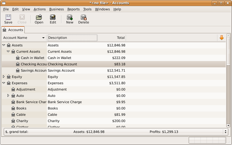
GnuCash


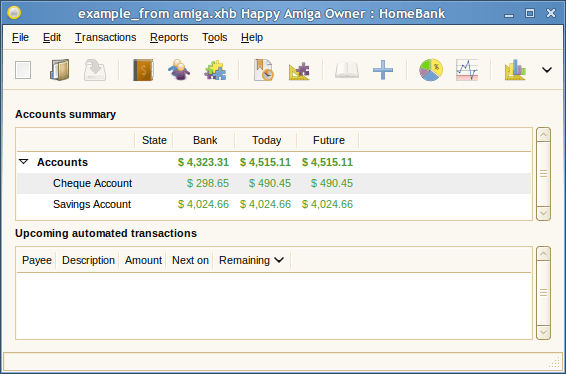
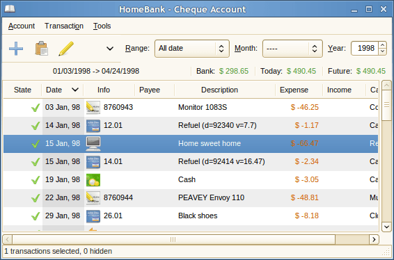
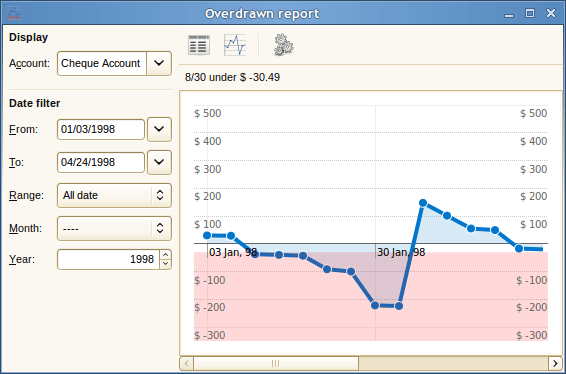
Homebank


Quicken
Cha-Ching

iBank

MS Money


Tentative Design
Pre-Design
accaunt overwiev with information table 
accaunt overwiev with graph 
accaunt overwiev with circle diagram 
item overwiev with circle diagram 
explantation of the buttons 
transfare window -> spend view 
transfare window -> transfare view 
transfare window -> repetitions view 
transfare window -> info view 
Discussion
- rename "Cash Managment" simply to "Cash" or "Money", it fits better to other apps like "Web", "Music" , ...
- Done
Comments and Feedback
- It's my first design ever in the gnome project, i hope for a great teamwork
- your mockups looks good ! Here is some notes (please, notice I'm not a designer) :
- why is there two groups of three buttons to change the view ? Are their effects different ? It's not clear as it is now what view they will change.
Oh, a small mistake
 - fixed
- May be we might add to the mockups an application menu including i.e a preference entry ?
- I hope in the next week is time for that...
- Transfare window added, preference is coming
- I hope in the next week is time for that...
- On the pie chart view, we might want to know about which account are these informations.
- The pie chart view, show the informations of the actually selected accaunt/item/shop/category in the left (blue highlighted)
- what is the empty place down to the app expected to do ?
great question
 I think it's great for data like total spend, I would add it
 - I didn't want to say that you had to put something in it, but if it's empty, don't add an horizontal seperation for it and leave the vertical separation between account list and view going to the bottom of the app.
- Ok, here is a try
- I didn't want to say that you had to put something in it, but if it's empty, don't add an horizontal seperation for it and leave the vertical separation between account list and view going to the bottom of the app.
- why is there two groups of three buttons to change the view ? Are their effects different ? It's not clear as it is now what view they will change.
- your mockups looks good ! Here is some notes (please, notice I'm not a designer) :
- There is a simple personal finance tool called avernus (avernus.launchpad.com), which fulfills most of the objectives. Avernus is developed using python, gtk3 and sqlalchemy. Maybe you could use at least parts of the code and the ideas. I attached some screenshots of the application.
Before you get started, it is very important to decide if you are going to use double-entry accounting or not. It is easier to design the code this way and expose it to the UI later than to redesign it to support it later. [http://en.wikipedia.org/wiki/Double-entry_bookkeeping_system]
- I think it's very important not to use double-entry accouting to keep the software simple and only for a personal or family use.
- I think Double-Entry it's better and powerful enough for actual and future Money uses. Including to PLUG it to an enterprise / small bussiness accounting systems. I've started to code an accounting system and may i'm able to start implementation.
